Remember how we all (in the US) grew up on this beacon of healthfulness?
 Well, this graphic isn’t as holy as we all were taught. In fact, this graphic was heavily influenced by out-of-date science promoted by industries that it benefitted. Hey, Got Milk?
Thankfully, Harvard came out to fix these wrongs with an amazing plate graphic: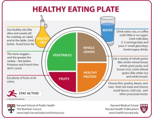
And, WOW, this seems more realistic! (Here is a Harvard-made pyramid graphic for those who prefer it):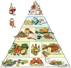
But what are the new graphics really saying?
1) Limit fatty dairy products, red and processed meats, sugary products, and unhealthy flour products.
2) Drink alcohol in moderation, if at all, but drink lots of water, tea, and coffee.
3) Use nuts, alternative meats, and lean meats and fish as protein sources.
4) Eat lots of healthy vegetables (avoid unhealthy vegetables), healthy fats, and whole-grain
View original post 19 more words